" width="346.6917931095137px"><path d="M 1.815 6.083 L 1.916 6.184 C 2.367 6.815 3.059 7.267 3.821 7.337 C 4.463 7.397 5.115 7.217 5.747 6.685 L 7.452 5.261 C 8.084 4.729 8.374 4.118 8.425 3.476 C 8.545 2.082 7.582 0.628 6.188 0.587 C 5.817 0.587 5.085 0.828 4.483 1.209 C 3.992 0.668 3.36 0.196 3.039 0.086 C 1.725 -0.335 0.321 0.858 0.05 2.212 C -0.08 2.864 0.03 3.556 0.532 4.258 L 1.815 6.073 Z" fill="rgb(255, 200, 244)" height="7.347994689259394px" id="g0GPXxC6H" transform="translate(259.5 5.5)" width="8.434649250780126px"/><path d="M 135.421 23.719 C 134.78 23.719 134.138 23.949 133.556 24.531 L 132.623 25.464 C 130.417 27.67 128.913 29.656 126.415 31.571 C 128.511 26.456 129.785 21.452 130.547 18.714 C 130.607 18.423 130.668 18.132 130.668 17.902 C 130.668 16.327 129.334 15.405 127.99 15.405 C 127.057 15.405 126.305 15.756 125.663 16.919 C 123.858 20.178 117.459 30.819 113.388 30.819 C 112.977 30.819 112.866 30.649 112.866 30.117 C 112.866 27.961 114.381 23.307 117.81 17.781 C 118.101 17.32 118.272 16.849 118.272 16.327 C 118.272 14.873 116.878 13.71 115.484 13.71 C 114.491 13.71 113.799 14.231 113.328 15.043 C 111.703 17.661 110.249 19.807 105.555 24.501 C 105.555 24.501 105.535 24.511 105.535 24.521 L 104.602 25.454 C 102.215 27.84 95.707 33.136 94.363 33.136 C 94.012 33.136 93.781 32.845 93.55 32.093 L 93.089 30.518 C 96.81 28.894 100.942 26.737 100.942 22.144 C 100.942 19.236 99.197 16.157 95.245 16.157 C 92.397 16.157 89.84 17.44 87.623 19.296 L 87.744 18.834 C 91.936 13.188 94.654 9.979 94.654 5.967 C 94.654 3.761 93.26 1.895 90.873 1.895 C 88.195 1.895 86.801 3.701 85.928 5.967 C 85.056 8.234 84.725 10.23 82.92 16.738 C 80.832 19.483 78.56 22.083 76.12 24.521 L 76.11 24.521 L 76.02 24.611 L 75.177 25.454 C 75.047 25.584 74.937 25.724 74.836 25.855 C 74.656 26.055 74.455 26.266 74.245 26.497 C 71.106 29.816 67.726 33.356 66.743 33.356 C 66.282 33.356 66.161 32.544 66.161 30.328 C 66.161 29.395 66.572 26.316 66.913 24.972 C 73.021 18.744 81.325 11.814 81.325 5.235 C 81.325 2.447 80.041 0 76.902 0 C 69.691 0 65.048 11.764 62.43 22.064 C 61.508 23.047 60.635 23.859 60.003 24.491 L 59.993 24.501 L 59.061 25.434 C 57.376 27.118 53.595 30.789 51.73 31.772 C 51.318 32.002 51.088 32.063 50.917 32.063 C 50.747 32.063 50.686 32.002 50.686 31.832 C 50.686 31.662 50.747 31.481 50.807 31.19 C 51.509 28.342 54.357 21.241 54.879 20.078 C 54.999 19.727 55.109 19.376 55.109 19.085 C 55.109 17.571 53.715 16.297 52.081 16.297 C 51.268 16.297 50.215 16.879 49.523 17.751 C 48.129 19.376 45.762 22.154 43.436 24.471 C 43.436 24.471 43.415 24.481 43.405 24.491 L 42.473 25.423 C 40.898 26.998 36.776 31.12 35.372 31.411 C 37.348 28.382 38.742 25.423 38.742 22.916 C 38.742 19.075 35.954 17.27 32.985 17.27 C 29.846 17.27 27.108 18.895 24.902 20.991 C 24.32 18.203 22.345 16.167 19.256 16.167 C 16.167 16.167 13.379 17.972 10.761 20.65 C 10.881 20.068 10.992 19.607 11.052 19.135 L 11.052 18.724 C 11.052 17.099 9.718 16.167 8.374 16.167 C 6.75 16.167 5.877 17.27 5.636 19.306 C 5.576 19.827 4.994 22.445 4.824 23.087 C 3.43 28.091 1.214 34.018 0.582 35.011 C 0.231 35.473 0 36.054 0 36.636 C 0 38.09 1.284 39.193 2.678 39.193 C 3.55 39.193 4.423 38.612 4.944 37.91 C 5.987 36.395 7.391 33.958 9.076 31.391 C 10.069 29.876 14.602 23.307 17.741 21.673 C 18.263 21.382 18.674 21.261 18.965 21.261 C 19.607 21.261 19.837 21.783 19.837 22.776 C 19.837 25.624 17.39 30.458 15.996 33.186 C 15.705 33.707 15.585 34.289 15.585 34.811 C 15.585 36.205 16.919 37.368 18.263 37.368 C 19.256 37.368 20.299 36.786 20.82 35.854 C 22.625 32.885 27.51 23.929 31.641 22.595 C 32.223 22.425 32.634 22.304 32.925 22.304 C 33.386 22.304 33.567 22.535 33.567 22.946 C 33.567 23.237 33.447 23.698 33.276 24.23 C 32.464 27.018 29.495 30.107 29.495 33.417 C 29.495 35.623 30.829 37.609 33.216 37.609 C 36.816 37.609 43.345 31.882 45.832 29.465 C 45.552 30.488 45.381 31.391 45.381 32.083 C 45.381 34.991 47.247 37.198 50.446 37.198 C 53.956 37.198 56.834 34.931 60.926 30.949 C 60.996 34.59 62.32 38.592 66.562 38.592 C 71.035 38.592 76.09 31.922 78.878 29.124 L 78.888 29.114 L 78.908 29.094 L 79.389 28.613 C 78.697 30.799 77.955 33.035 77.203 35.272 C 77.083 35.683 77.033 36.024 77.033 36.375 C 77.033 37.95 78.316 38.933 79.65 38.933 C 80.583 38.933 81.566 38.411 82.097 37.187 C 83.722 33.346 88.666 23.057 93.901 21.482 C 94.363 21.362 94.774 21.251 95.065 21.251 C 95.526 21.251 95.767 21.482 95.767 22.004 C 95.767 22.355 95.596 22.756 95.125 23.287 C 93.671 24.802 90.12 26.025 88.847 26.607 C 87.744 27.068 87.272 27.941 87.272 28.873 C 87.272 29.164 87.272 29.515 87.393 29.806 L 88.556 33.527 C 89.368 36.144 91.053 38.411 93.962 38.411 C 97.893 38.411 104.462 32.825 107.631 29.786 L 107.631 30.037 C 107.631 33.407 109.958 35.974 113.388 35.974 C 115.775 35.974 118.101 34.69 120.308 32.835 C 119.846 33.938 119.375 34.991 118.914 36.034 C 115.775 37.839 112.575 39.584 109.486 41.44 C 106.057 43.536 103.96 46.264 103.96 49.172 C 103.96 52.492 106.698 54.758 109.717 54.758 C 114.832 54.758 119.546 47.718 123.216 39.574 C 128.281 36.606 132.102 33.346 136.344 29.104 L 137.277 28.171 C 137.858 27.59 138.089 26.948 138.089 26.306 C 138.089 24.912 136.805 23.628 135.411 23.628 Z M 73.663 6.679 C 74.295 5.907 75.318 4.984 76.03 5.666 C 76.812 6.419 75.919 7.933 75.408 8.545 C 74.696 9.397 70.815 13.639 68.428 16.327 C 70.083 11.684 72.77 7.772 73.663 6.679 Z M 109.727 49.603 C 109.376 49.603 109.206 49.433 109.206 49.192 C 109.206 48.61 109.496 47.798 112.174 46.053 C 112.987 45.532 113.919 44.95 114.671 44.479 C 113.277 46.865 111.593 49.593 109.727 49.593 Z" fill="rgb(208, 182, 255)" height="54.75826086956407px" id="m2vaSeFD1" transform="translate(208.603 0)" width="138.0891014591231px"/><path d="M 26.699 24.11 C 26.709 23.829 26.648 23.578 26.528 23.337 C 26.448 23.087 26.308 22.876 26.117 22.696 C 26.027 22.595 25.916 22.515 25.806 22.445 C 25.756 22.405 25.716 22.365 25.656 22.325 C 25.325 22.104 24.984 22.044 24.422 22.044 C 23.078 22.044 21.233 23.558 20.671 24.06 C 19.718 24.952 19.608 25.012 19.438 25.012 C 19.267 25.012 19.157 24.792 18.986 24.28 C 18.314 22.154 17.592 20.198 16.92 17.791 C 16.81 17.4 16.75 17.119 16.75 16.949 C 16.75 16.778 16.81 16.618 17.141 16.277 C 20.441 12.978 22.567 10.741 23.128 9.227 C 23.74 7.602 24.021 6.368 24.021 5.476 C 24.021 4.302 23.75 2.888 22.647 1.936 C 21.895 1.284 21.614 1.053 20.601 0.612 C 19.197 0 18.304 0 17.582 0 C 13.892 0 11.986 2.126 10.863 4.202 C 10.582 4.704 10.131 5.937 9.97 6.609 C 9.8 7.221 9.689 8.284 9.689 9.738 C 9.689 11.192 9.8 12.647 10.191 14.331 C 10.251 14.552 10.301 15.003 10.301 15.114 C 10.301 15.565 10.081 15.786 9.629 16.237 C 7.674 18.082 6.55 19.035 6.049 19.536 C 3.812 21.833 2.017 23.678 0.673 26.587 C 0.282 27.429 0.022 28.181 0.001 29.024 C -0.019 29.916 0.162 31.18 0.804 32.173 C 1.375 33.066 2.408 34.139 4.535 34.811 C 5.768 35.202 6.55 35.262 7.503 35.262 C 9.519 35.262 11.475 34.811 12.819 34.48 C 13.992 34.199 15.787 33.246 16.178 33.246 C 16.349 33.246 16.399 33.356 16.569 33.697 C 16.68 33.918 16.79 34.199 16.85 34.48 C 16.87 34.56 16.91 34.63 16.95 34.71 C 17.001 34.951 17.081 35.192 17.191 35.412 C 17.693 36.465 18.555 37.458 19.829 37.398 C 20.471 37.368 20.992 37.218 21.574 36.947 C 21.684 36.897 21.784 36.816 21.885 36.746 C 21.915 36.726 21.945 36.716 21.965 36.696 C 22.005 36.666 22.035 36.626 22.075 36.596 C 22.145 36.536 22.216 36.465 22.276 36.385 C 22.296 36.355 22.326 36.335 22.346 36.315 C 22.356 36.285 22.366 36.265 22.376 36.235 C 22.416 36.165 22.486 36.114 22.527 36.054 C 22.547 36.014 22.557 35.984 22.577 35.944 C 22.587 35.914 22.607 35.874 22.617 35.844 C 22.647 35.783 22.677 35.713 22.707 35.653 C 22.737 35.593 22.707 35.643 22.707 35.633 C 22.827 35.212 22.807 34.76 22.707 34.319 C 22.436 33.066 22.045 31.822 21.584 30.629 C 21.534 30.508 21.484 30.398 21.433 30.288 C 21.524 30.197 21.644 30.117 21.835 29.987 C 23.63 28.863 23.84 28.573 24.322 28.242 C 24.583 28.091 24.823 27.921 25.074 27.7 C 25.395 27.419 25.646 27.058 25.896 26.717 C 26.057 26.497 26.227 26.266 26.338 26.015 C 26.558 25.544 26.679 25.163 26.689 24.631 C 26.689 24.461 26.669 24.29 26.689 24.12 Z M 13.902 28.583 C 10.492 30.097 7.914 30.538 7.242 30.538 C 6.681 30.538 6.29 30.428 6.29 29.756 C 6.29 28.362 7.463 26.787 8.025 26.065 C 8.476 25.454 9.98 23.378 11.043 22.314 C 11.495 21.863 11.936 21.472 12.106 21.472 C 12.217 21.472 12.277 21.582 12.387 21.923 L 14.182 27.239 C 14.243 27.409 14.403 27.961 14.403 28.191 C 14.403 28.302 14.403 28.362 13.902 28.583 Z M 16.309 9.838 C 15.466 10.902 15.356 11.012 15.185 11.012 C 15.075 11.012 15.015 10.731 15.015 10.009 C 15.015 8.053 15.466 7.151 16.64 5.255 C 17.251 4.252 17.703 4.022 18.204 3.961 C 18.425 3.931 18.896 4.182 18.926 4.523 C 18.976 5.004 18.786 5.847 18.615 6.188 C 18.334 6.689 18.144 7.552 16.299 9.848 Z" fill="rgb(255, 200, 244)" height="37.400689477048914px" id="GMqpbThti" transform="translate(176.51 5.516)" width="26.69971090019546px"/><path d="M 19.45 10.909 C 16.833 9.505 14.165 9.314 11.357 9.104 L 10.203 9.014 C 9.13 8.933 8.027 8.853 7.135 8.352 C 6.872 8.215 6.689 7.962 6.643 7.67 C 6.573 7.289 6.713 6.837 6.994 6.516 C 7.526 5.905 8.689 5.463 9.552 5.303 C 10.444 5.142 11.718 4.992 12.801 5.202 C 13.633 5.373 14.907 5.744 15.709 6.235 C 16.02 6.426 16.361 6.677 16.692 6.927 C 16.973 7.138 17.254 7.349 17.525 7.519 C 18.267 8.011 18.628 7.991 19.35 7.429 C 19.851 7.048 20.604 6.356 21.095 5.905 C 21.306 5.714 21.476 5.554 21.546 5.493 C 21.647 5.403 21.727 5.303 21.787 5.213 C 21.938 4.995 21.968 4.715 21.867 4.47 C 21.747 4.17 21.546 3.929 21.255 3.718 C 20.914 3.478 20.624 3.237 20.323 2.986 C 19.992 2.715 19.661 2.445 19.28 2.174 C 15.89 -0.233 11.126 -0.323 7.807 0.389 C 6.382 0.689 5.059 1.301 3.645 2.304 C 1.819 3.598 0.877 5.453 0.987 7.529 C 1.117 9.966 2.311 11.862 4.367 12.875 C 5.43 13.396 6.653 13.747 8.127 13.948 C 9.331 14.108 10.635 14.219 12.249 14.299 C 13.493 14.359 14.927 14.64 16.08 15.051 C 16.431 15.181 16.843 15.643 17.063 16.144 C 17.224 16.525 17.254 16.876 17.154 17.107 C 16.953 17.558 16.682 17.869 16.341 18.08 C 15.679 18.471 14.837 18.782 14.075 18.912 C 10.875 19.484 7.285 18.451 4.918 16.295 C 4.818 16.204 4.718 16.144 4.627 16.094 L 4.226 15.934 L 3.985 16.024 C 3.885 16.054 3.755 16.104 3.624 16.184 C 2.772 16.776 1.92 17.368 1.077 17.969 C 0.836 18.14 0.626 18.35 0.445 18.521 C 0.235 18.732 -0.036 19.063 0.004 19.474 C 0.044 19.875 0.355 20.126 0.586 20.276 C 0.726 20.366 0.897 20.517 1.067 20.657 C 1.328 20.878 1.599 21.108 1.839 21.239 C 5.249 23.164 7.927 24.047 11.066 24.258 C 11.377 24.278 11.698 24.288 12.029 24.288 C 13.092 24.288 14.245 24.167 15.579 23.937 C 15.82 23.897 16.201 23.796 16.431 23.726 C 17.515 23.375 18.507 22.864 19.34 22.422 C 19.611 22.272 19.861 22.101 20.102 21.901 C 20.945 21.189 21.396 20.386 21.877 19.534 C 21.977 19.353 22.078 19.173 22.188 18.982 C 22.509 18.431 22.7 17.819 22.74 17.157 C 22.93 14.439 21.707 12.102 19.45 10.899 Z M 50.45 2.615 C 50.46 2.154 50.47 1.763 50.45 1.592 C 50.43 1.201 50.109 0.609 49.607 0.529 C 49.427 0.499 49.246 0.499 49.026 0.499 L 47.301 0.499 C 45.606 0.509 29.379 0.499 28.697 0.479 C 28.516 0.479 28.346 0.509 28.216 0.539 L 27.754 0.619 L 27.674 0.95 C 27.604 1.251 27.604 4.721 27.624 4.872 C 27.674 5.243 27.925 5.533 28.306 5.664 C 28.416 5.704 28.546 5.724 28.667 5.744 L 28.847 5.764 C 29.79 5.744 32.117 5.764 33.982 5.784 C 34.875 5.784 35.677 5.794 36.179 5.804 L 36.179 6.396 C 36.209 7.7 36.239 9.344 36.249 10.648 C 36.249 11.751 36.219 14.138 36.189 16.545 C 36.148 19.083 36.118 21.71 36.128 22.874 C 36.128 23.435 36.58 23.897 37.151 23.907 L 40.882 23.907 C 41.494 23.907 41.875 23.576 41.895 22.984 C 41.932 21.54 41.935 20.095 41.905 18.651 C 41.895 18.07 41.875 17.498 41.885 16.916 C 41.895 14.098 41.985 7.981 42.025 5.754 L 42.427 5.754 C 42.938 5.734 43.46 5.714 43.921 5.694 C 44.172 5.684 45.616 5.694 46.889 5.694 C 48.564 5.694 49.597 5.704 49.778 5.694 C 49.993 5.674 50.192 5.57 50.329 5.403 C 50.46 5.233 50.52 5.012 50.48 4.801 C 50.41 4.42 50.44 3.327 50.46 2.605 Z M 80.146 22.272 L 79.494 21.339 C 79.183 20.898 78.882 20.457 78.571 20.005 C 78.24 19.524 77.949 19.022 77.658 18.541 C 77.267 17.879 76.856 17.197 76.365 16.535 C 75.743 15.723 75.181 14.971 74.65 14.198 C 76.274 13.577 77.348 12.524 77.929 10.999 C 78.401 9.756 78.812 8.522 78.631 6.998 C 78.35 4.631 77.578 2.926 76.335 1.923 C 75.151 0.98 73.476 0.459 71.621 0.459 C 70.969 0.459 69.926 0.459 68.753 0.469 C 65.975 0.489 62.164 0.509 61.181 0.459 L 57.3 0.459 C 56.979 0.459 56.708 0.539 56.517 0.73 C 56.247 0.99 56.206 1.371 56.206 1.662 C 56.206 2.124 56.206 2.595 56.216 3.056 L 56.216 3.718 C 56.226 3.979 56.226 4.24 56.216 4.51 C 56.216 5.112 56.216 5.744 56.267 6.366 C 56.347 7.319 56.377 8.041 56.367 8.733 C 56.347 9.906 56.357 15.201 56.357 19.063 L 56.357 22.703 C 56.357 22.984 56.387 23.375 56.698 23.656 C 57.039 23.957 57.5 23.907 57.651 23.886 C 57.801 23.866 58.744 23.886 59.436 23.886 C 60.74 23.907 61.141 23.907 61.201 23.886 C 62.013 23.886 62.013 23.265 62.013 22.864 C 62.013 22.523 61.993 22.172 61.963 21.8 C 61.933 21.389 61.893 16.615 61.953 14.85 C 63.076 14.85 65.433 14.84 65.784 14.83 C 66.366 14.83 66.998 14.84 67.67 14.86 L 68.331 14.88 C 68.642 15.322 68.943 15.753 69.264 16.184 C 69.846 16.987 70.387 17.779 70.929 18.581 C 71.511 19.434 72.092 20.286 72.714 21.139 C 72.945 21.459 73.185 21.821 73.426 22.172 C 73.677 22.543 73.918 22.914 74.158 23.245 C 74.479 23.676 74.941 23.897 75.502 23.876 L 75.953 23.876 C 76.274 23.886 76.495 23.897 76.696 23.897 L 77.197 23.897 C 77.408 23.897 77.658 23.886 78.009 23.886 C 78.29 23.897 78.641 23.886 78.982 23.886 L 79.624 23.886 C 79.925 23.886 80.226 23.746 80.386 23.485 C 80.537 23.235 80.537 22.924 80.386 22.653 C 80.316 22.523 80.226 22.392 80.136 22.262 Z M 73.386 8.432 C 73.095 9.214 72.634 9.565 71.701 9.716 C 71.23 9.796 70.748 9.776 70.247 9.746 C 69.916 9.726 69.595 9.716 69.274 9.726 C 68.843 9.736 68.422 9.736 67.99 9.726 L 66.957 9.726 C 66.617 9.726 66.286 9.746 65.945 9.766 L 65.363 9.796 C 65.152 9.796 64.952 9.816 64.741 9.806 L 61.863 9.716 L 61.863 8.703 C 61.833 7.67 61.823 6.677 61.823 5.614 L 61.903 5.614 C 62.254 5.594 62.605 5.594 62.956 5.594 L 64.36 5.594 C 65.734 5.574 67.108 5.564 68.482 5.564 C 69.224 5.564 69.956 5.584 70.688 5.614 C 70.879 5.614 71.069 5.654 71.26 5.694 L 71.551 5.744 C 72.493 5.884 72.935 6.155 73.296 6.807 C 73.486 7.148 73.537 8.031 73.386 8.432 Z M 61.331 23.375 M 100.805 0.459 C 100.053 0.288 99.201 0.168 98.138 0.098 C 97.014 0.028 95.721 -0.003 94.607 0.338 C 94.447 0.389 94.286 0.429 94.126 0.469 C 93.875 0.539 93.625 0.599 93.384 0.689 C 92.772 0.91 92.271 1.121 91.829 1.341 C 88.008 3.217 85.391 7.038 85.02 11.32 C 84.779 14.058 85.561 16.876 87.296 19.454 C 87.457 19.704 87.657 19.905 87.898 20.166 C 88.901 21.239 90.104 22.151 91.198 22.683 C 93.364 23.736 95.239 24.227 97.265 24.278 L 97.556 24.278 C 101.507 24.278 105.007 22.442 107.705 18.952 C 108.618 17.779 109.39 16.084 109.691 14.65 C 109.861 13.807 109.942 12.945 109.922 12.102 C 109.861 9.525 108.919 6.948 107.104 4.43 C 105.679 2.445 103.503 1.071 100.805 0.449 Z M 102.119 17.177 C 101.026 18.28 99.552 18.852 97.486 18.982 C 96.032 19.073 94.597 18.521 92.983 17.227 C 91.458 16.014 90.616 14.128 90.676 12.062 C 90.736 9.886 91.789 7.86 93.494 6.657 C 94.457 5.975 95.55 5.684 96.603 5.463 C 96.944 5.393 97.285 5.363 97.626 5.363 C 100.474 5.363 103.212 7.72 103.964 10.197 C 104.145 10.779 104.255 11.4 104.325 12.072 C 104.506 14.018 103.252 16.034 102.129 17.177 Z M 138.254 13.276 L 138.254 10.899 C 138.234 9.916 138.223 8.943 138.213 7.96 C 138.193 7.028 138.223 5.423 138.254 4.009 C 138.294 1.883 138.294 1.512 138.254 1.361 C 138.113 0.79 137.762 0.509 137.18 0.499 C 135.997 0.489 134.814 0.499 133.63 0.499 C 133.44 0.499 133.289 0.579 133.119 0.659 L 132.798 0.78 L 132.798 1.712 C 132.798 2.124 132.798 3.387 132.778 4.671 C 132.768 5.925 132.748 7.198 132.758 7.75 C 132.768 8.853 132.808 10.498 132.838 11.721 L 132.858 12.494 C 132.868 12.985 132.898 14.058 132.908 14.951 C 131.845 13.647 127.101 6.968 125.848 4.962 C 125.537 4.47 124.333 2.896 123.531 1.853 C 123.26 1.492 123.04 1.211 122.939 1.081 C 122.468 0.449 122.017 0.439 121.495 0.499 L 117.293 0.499 C 116.992 0.459 116.792 0.569 116.681 0.659 C 116.43 0.87 116.42 1.181 116.41 1.412 C 116.41 1.492 116.41 1.582 116.39 1.672 C 116.36 1.823 116.32 2.003 116.32 2.204 L 116.32 2.675 C 116.33 3.648 116.34 4.631 116.37 5.604 C 116.38 5.945 116.4 6.286 116.43 6.627 C 116.461 7.058 116.491 7.479 116.491 7.91 L 116.491 8.973 C 116.491 12.082 116.491 21.56 116.39 22.182 C 116.33 22.533 116.35 22.874 116.38 23.134 C 116.42 23.515 116.721 23.826 117.122 23.886 C 117.263 23.907 117.403 23.917 117.544 23.907 L 121.094 23.907 C 121.184 23.907 121.274 23.897 121.385 23.876 C 121.726 23.806 121.966 23.505 121.977 23.164 L 122.037 21.289 C 122.057 20.767 122.037 18.07 122.037 17.448 L 121.966 11.16 C 121.966 11.09 121.956 10.849 121.936 10.518 C 121.906 9.996 121.876 9.254 121.846 8.562 C 123.451 10.769 126.179 14.519 127.172 15.753 C 128.937 17.959 130.611 20.286 132.236 22.543 L 132.607 23.064 C 132.848 23.405 133.219 23.917 133.851 23.917 L 137.742 23.917 L 138.113 23.856 L 138.244 23.546 C 138.319 23.425 138.36 23.286 138.364 23.144 L 138.364 22.312 C 138.374 21.52 138.384 20.687 138.334 19.945 C 138.264 19.032 138.254 15.292 138.244 13.276 Z M 168.33 10.387 C 165.552 10.398 162.092 10.418 159.314 10.428 L 157.609 10.428 C 156.747 10.428 156.326 10.859 156.316 11.721 C 156.316 11.832 156.316 12.002 156.336 12.163 C 156.336 12.273 156.346 12.393 156.356 12.463 C 156.366 13.025 156.376 13.436 156.376 14.008 L 156.376 14.158 C 156.376 14.289 156.366 14.409 156.376 14.539 C 156.436 15.051 156.827 15.422 157.349 15.452 C 157.559 15.462 157.78 15.472 158.001 15.452 C 158.271 15.422 158.552 15.442 158.823 15.452 C 158.973 15.452 159.114 15.462 159.264 15.472 C 160.327 15.492 161.902 15.552 162.965 15.603 L 163.206 15.603 C 163.266 15.613 163.346 15.613 163.416 15.623 L 163.326 15.773 C 163.035 16.264 162.544 17.087 162.464 17.187 C 159.826 20.075 155.162 19.634 152.364 17.588 C 151.502 16.956 150.84 15.532 150.599 14.479 C 150.278 13.135 150.298 11.731 150.639 10.207 C 151.271 7.409 153.778 5.413 156.727 5.373 C 159.816 5.343 162.052 6.647 163.697 9.405 C 163.938 9.806 164.429 9.956 164.84 9.756 C 165.061 9.645 165.282 9.515 165.472 9.375 C 165.753 9.174 165.984 9.014 166.204 8.853 C 166.535 8.622 166.856 8.402 167.267 8.091 C 168.361 7.278 168.1 6.426 167.929 6.105 C 167.719 5.684 167.448 5.283 167.127 4.912 C 166.846 4.591 166.555 4.28 166.254 3.969 C 166.064 3.768 165.873 3.578 165.693 3.377 C 164.068 1.602 161.721 0.539 158.502 0.118 C 157.609 0.007 156.617 0.028 155.393 0.198 C 153.137 0.509 150.87 1.432 149.185 2.725 C 147.55 3.979 146.447 5.604 145.525 8.151 C 144.281 11.541 144.702 15.572 146.618 18.681 C 148.553 21.821 151.853 23.796 155.905 24.258 C 156.276 24.298 156.687 24.318 157.128 24.318 C 158.301 24.318 159.625 24.177 160.548 23.937 C 161.872 23.596 163.196 23.014 164.178 22.332 C 165.011 21.76 165.743 21.098 166.345 20.527 C 168.561 18.441 169.293 15.051 169.514 13.687 L 169.534 13.587 C 169.624 13.025 169.735 12.323 169.704 11.721 C 169.654 10.668 169.333 10.428 168.31 10.398 Z" fill="rgb(208, 182, 255)" height="24.317735293138792px" id="GDcj1hxgM" transform="translate(0 14.542)" width="169.70950825865438px"/></g></svg>)


THE PROJECT →
Merenda: crafting the brand identity of a nostalgic & whimsical indipendent bakery
Logo Design
Branding
Merenda is an independent Italian bakery located in the sunny seaside town of Brighton, UK.
The owner pictured Merenda not just as a place to buy freshly baked goods, but also a comfortable space to socialise and share a snack with friends and family.
The italian word “Merenda” in fact means snack time, and although it can be enjoyed as an adult, too, in the collective mind it’s often associated with the carefree after-school afternoons of one’s childhood.
THE VISION →
"We want the customers to feel how cozy and playful the Merenda experience will be as soon as they start smelling the freshly baked pizzette from out the door"
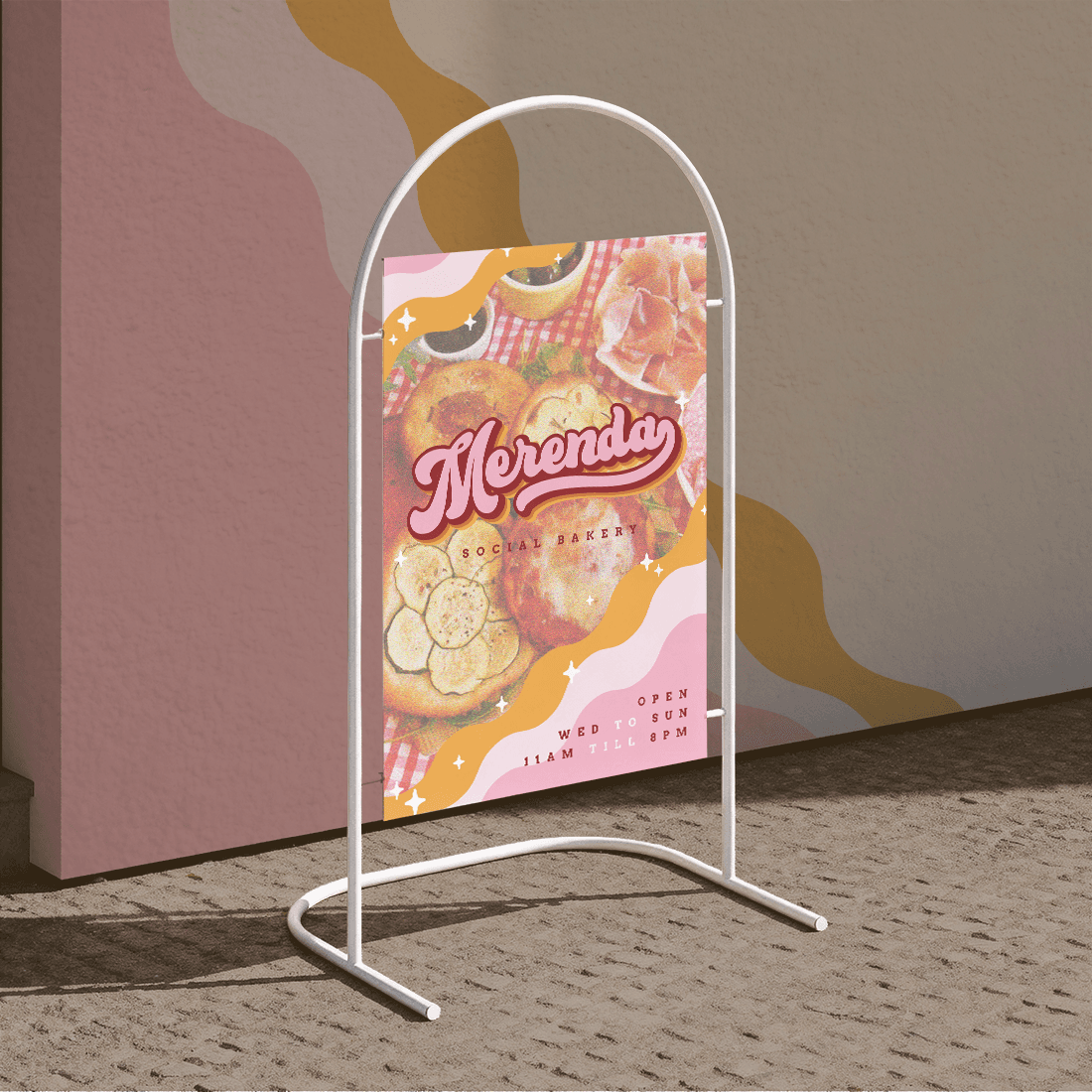
Minimalism has no place when the keyword is 90s nostalgia. Both the signage and the outside wall are decorated with a recurring undulated motif and sparkles, to set up the mood and intrigue the customer before they even walk in.
THE LOGO →
Conveying warmth & childlike joy
Merenda's logo was designed with customised hand lettering. The irregular cursive letters and the colourful drop shadows are reminiscent of old-school cartoons.
The colour palette range between the warmth of pinks and oranges, just like an old family photo in that giant album your aunt insists of keeping.
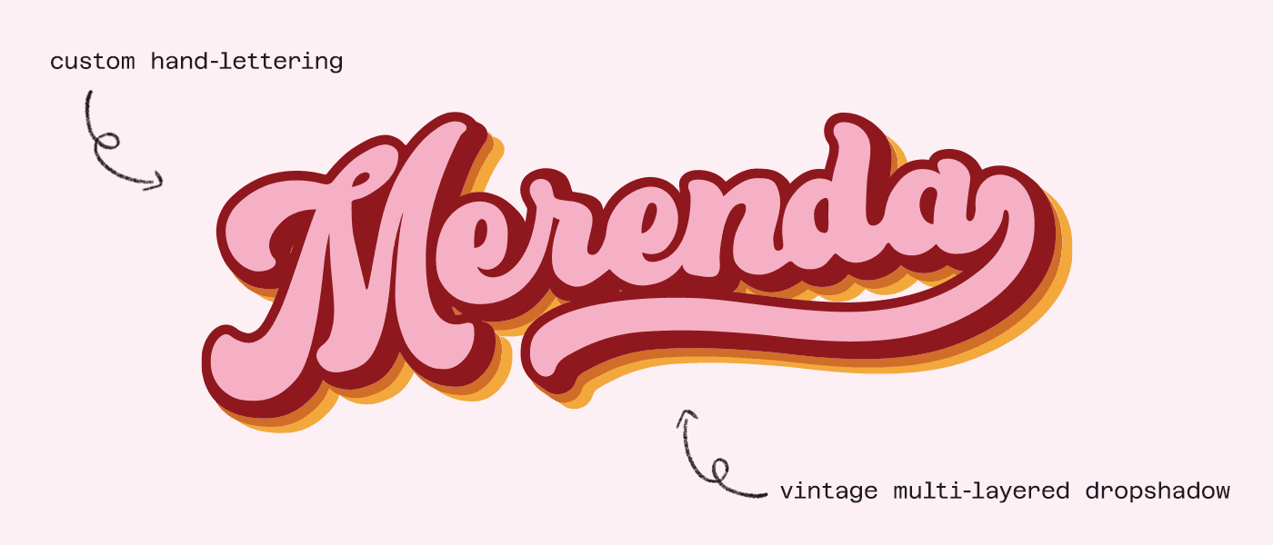
↑ The full colour logo
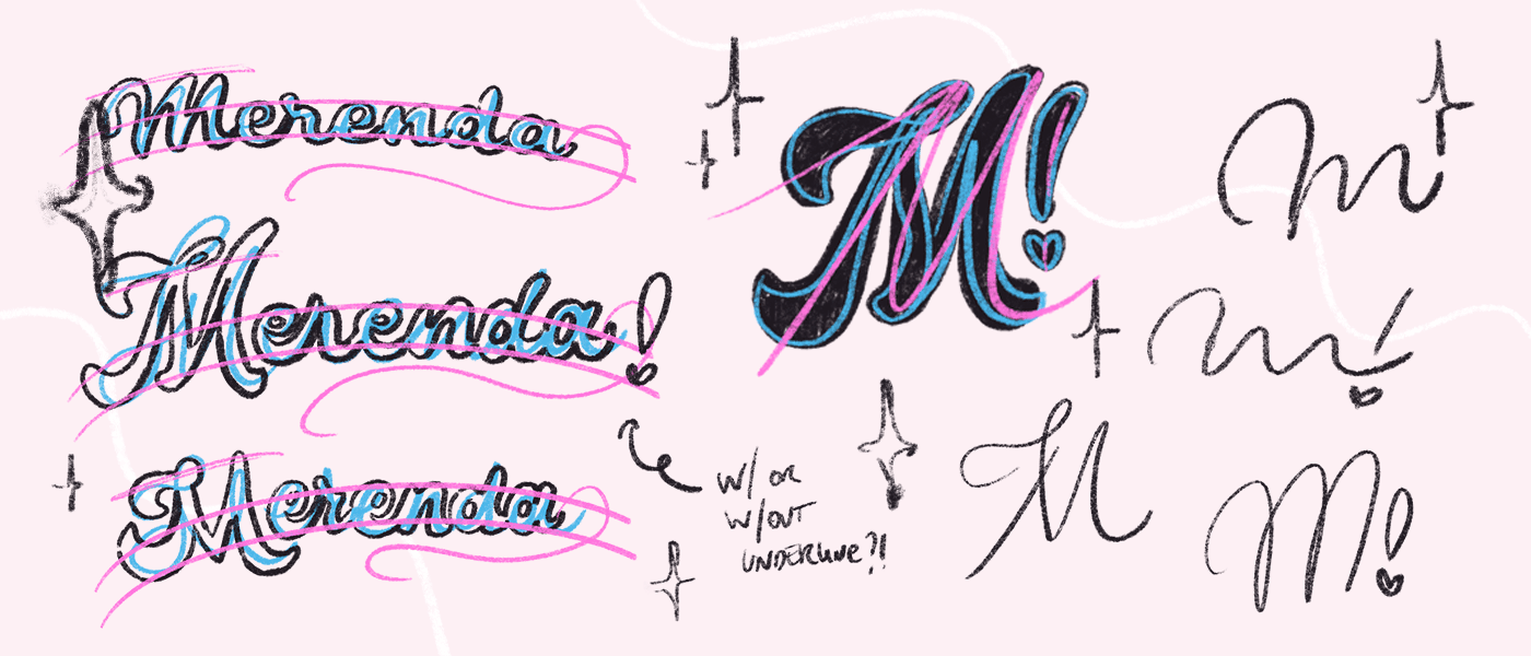
↑ Brainstorming ideas around the keywords agreed upon with the client
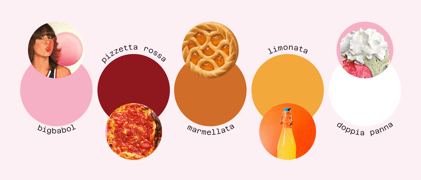
↑ Warm colour palette inspired by some merenda time classics
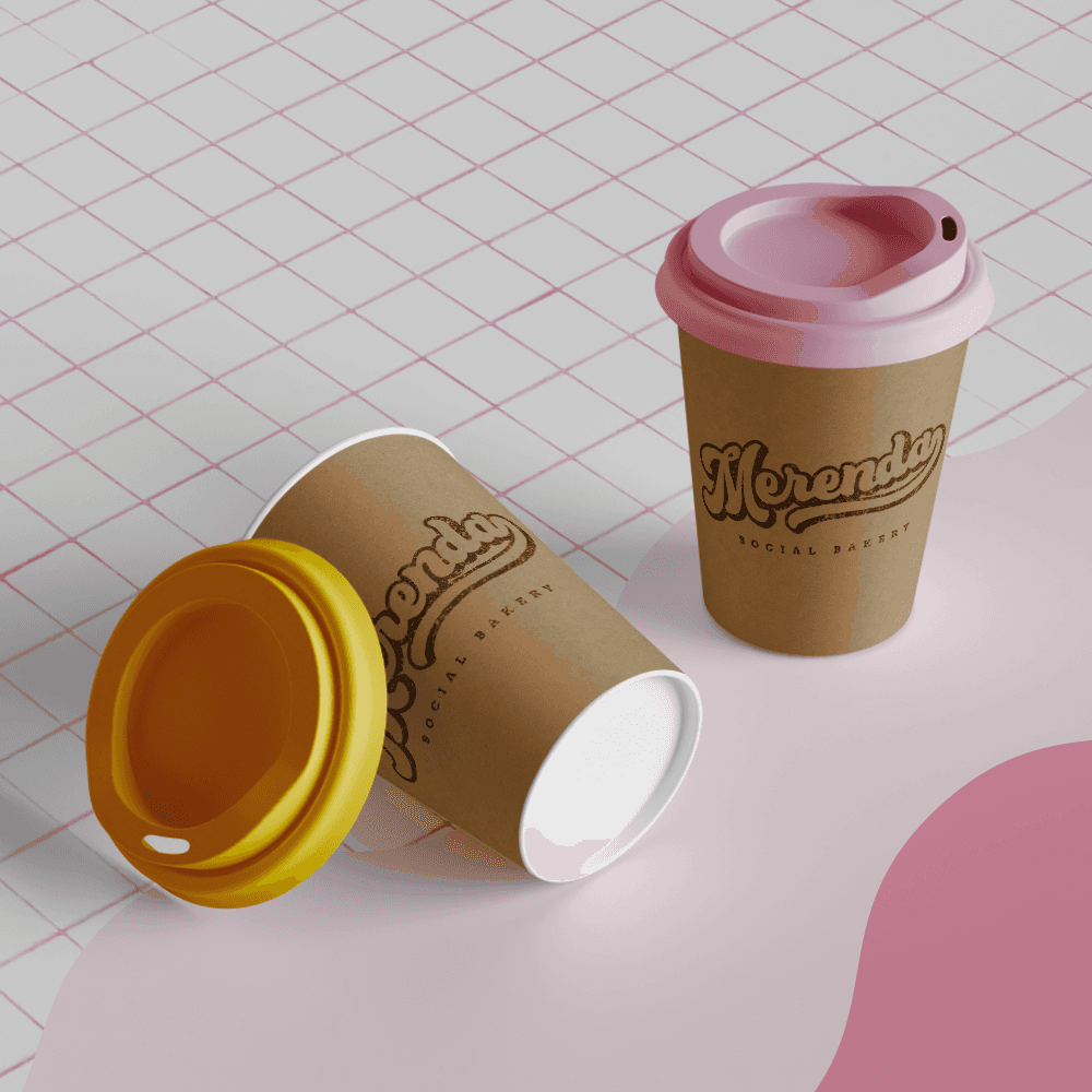
BEING MINDFUL OF BUDGET & WASTE →
Keeping the shop visual assets colourful & the packaging simple
All of the shop permanent asset like signage, menus, and point cards are colourful and maximalist, to keep the experience of visiting Merenda exciting and playful.


Instead, to give the owner the chance to experiment with a variety of takeaway systems at a reasonable cost, packaging has been kept simple: plain kraft paper for a homely feeling, customised by stamps and stickers.